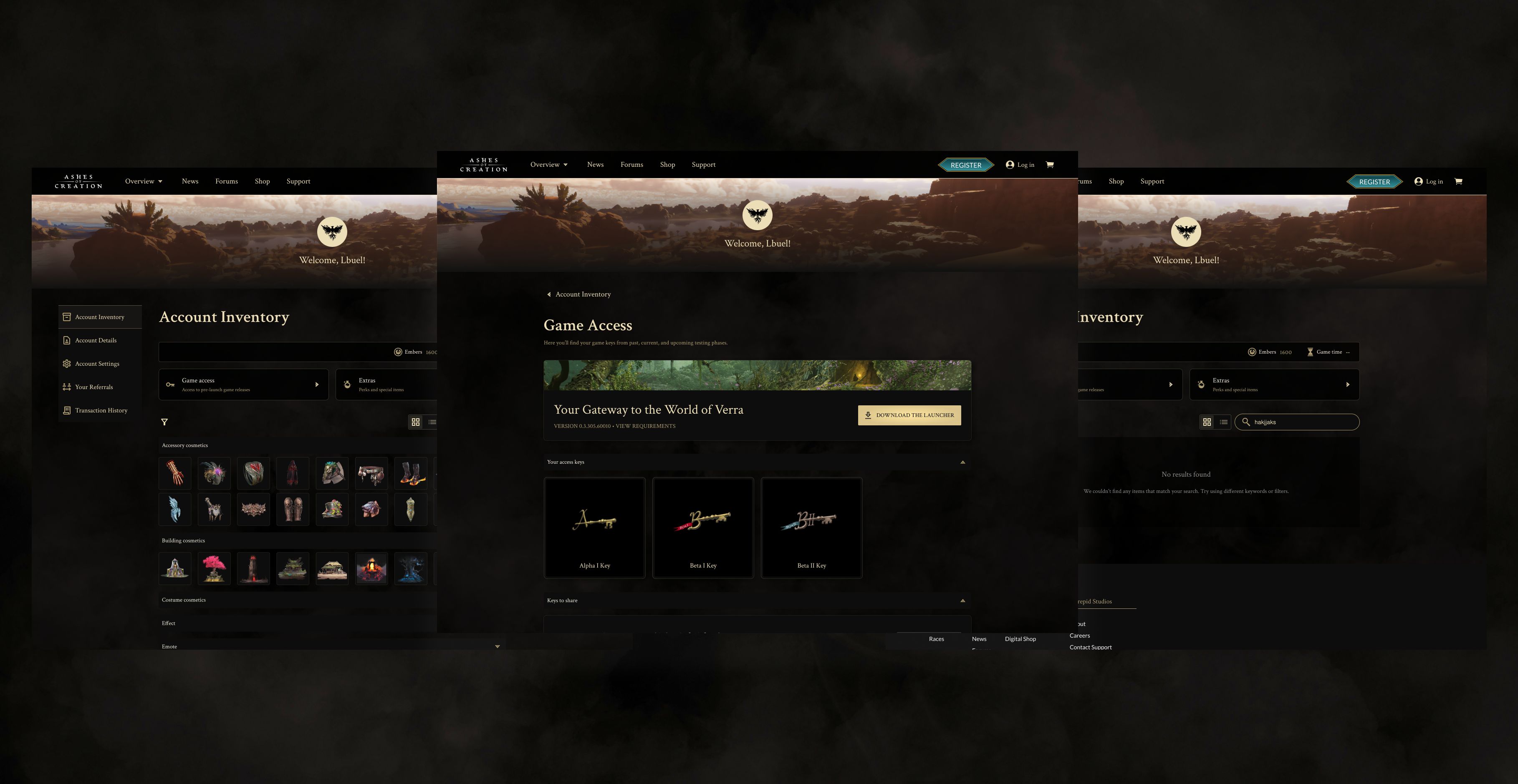
News Experience Redesign

Services
User Research & Usability Testing
UX & Product Design
UI & Visual Design
Accessibility (WCAG 2.1)
role
UX/UI Designer
Platform
Web ~ Desktop & Mobile
Timeline
2 Weeks • 2026
Project Info
The Ashes of Creation news section had a discoverability problem. No useful filters, unclear categories, outdated CMS components, and article pages that were hard to read on mobile meant users were missing content and leaving quickly. I led a full redesign of the news listing and article experience, benchmarking editorial and gaming platforms including Riot, Bungie, Polygon, and Bloomberg. The work covered a restructured information architecture with dedicated category pages, a combined search and filter system, a rebuilt article layout with stronger hierarchy and typography, and modernized CMS components built in partnership with engineering. The result is a faster, more scalable content system that keeps users reading longer and makes it easier for the team to publish.
The process & execution 🤺
01 Research & component strategy
I benchmarked gaming studios, media outlets, and entertainment platforms, including Riot, Bungie, Netflix, Polygon, and Bloomberg. I focused on category hierarchy, filtering patterns, and editorial presentation.
02 New information architecture
I redesigned the category structure and introduced dedicated category pages, collaborating closely with the community team to align on a future-facing tagging framework. I partnered with backend engineers to ensure the system could scale easily as new categories and metadata needs emerge.

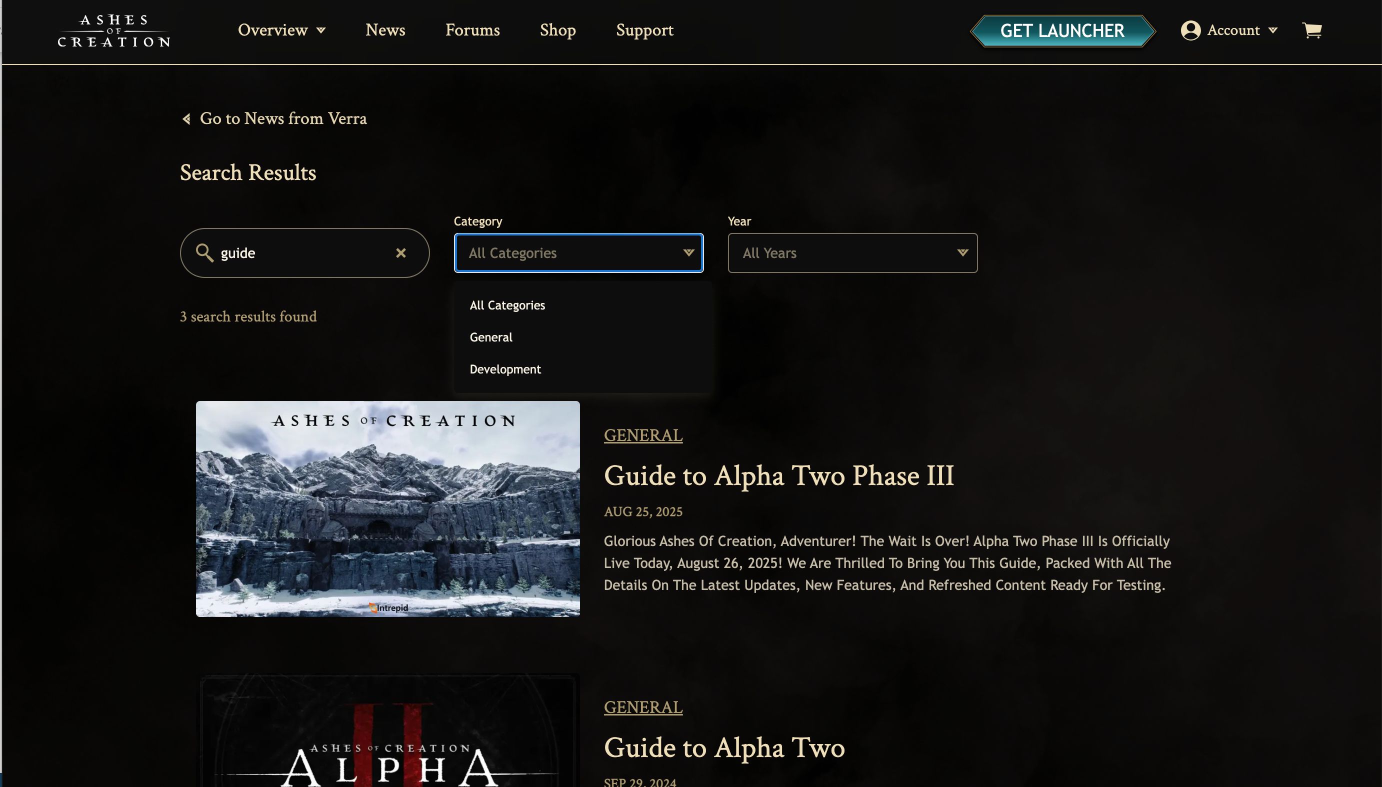
03 Improved search and filters
Users can now filter by category, year, post type, and keyword. Filters can be combined, and results update without losing context. This greatly reduces the time spent searching.
04 New article layout
I redesigned the entire article experience with a stronger hierarchy, improved spacing, enhanced hero sections, and more readable typography. I added subtle navigation aids and clear share triggers.
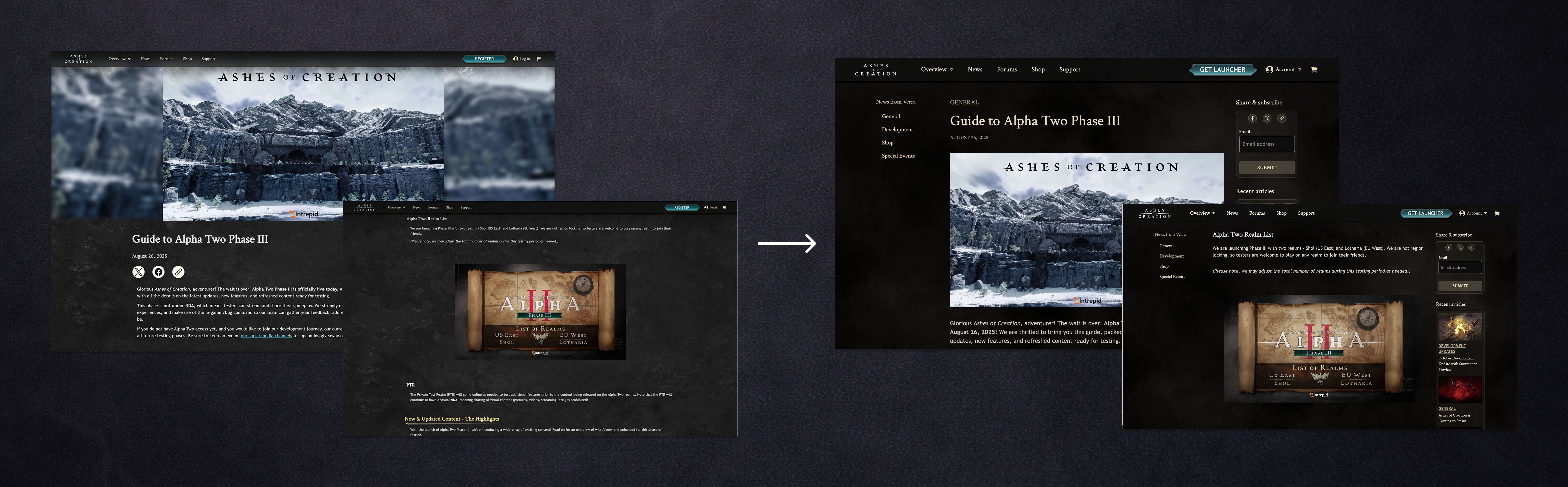
05 Rebuilt CMS components
I partnered with engineering to modernize all article building blocks. We redesigned paragraph styles, image blocks, galleries, embeds, quotes, and dividers. The result is a modular, scalable content system that is easier for the team to maintain.
06 Engagement enhancements
I introduced inline share prompts, a mobile-friendly share bar, curated recent articles, and contextual recommendations. These features help keep users reading and interacting.
07 Impact & results
Faster and more predictable content discovery
Longer reading sessions due to improved layout
Lower bounce rate on article pages
More efficient content creation with flexible CMS modules
Stronger mobile experience
Key Takeaways
The redesigned News page establishes a scalable and flexible framework that enhances content quality without introducing unnecessary complexity. By refining layout rules, improving visual hierarchy, and clarifying interaction patterns, the new system creates a more consistent editorial experience across diverse content types while reducing ambiguity for both designers and developers.
Next Steps
Monitor Google Analytics to track engagement changes (CTR, scroll depth, time on page) after launch.
Collect feedback from the marketing and content teams to identify any adjustments to layout or asset needs.
Expand the component documentation to support future editorial layouts and special event articles.