Admin Tool Design Library

Services
Brand & Graphic Design
Design Systems
Accessibility (WCAG 2.1)
UI & Visual Design
role
UX/UI Designer
Platform
Web ~ Desktop & Mobile
Timeline
4 months • 2025
Project Info
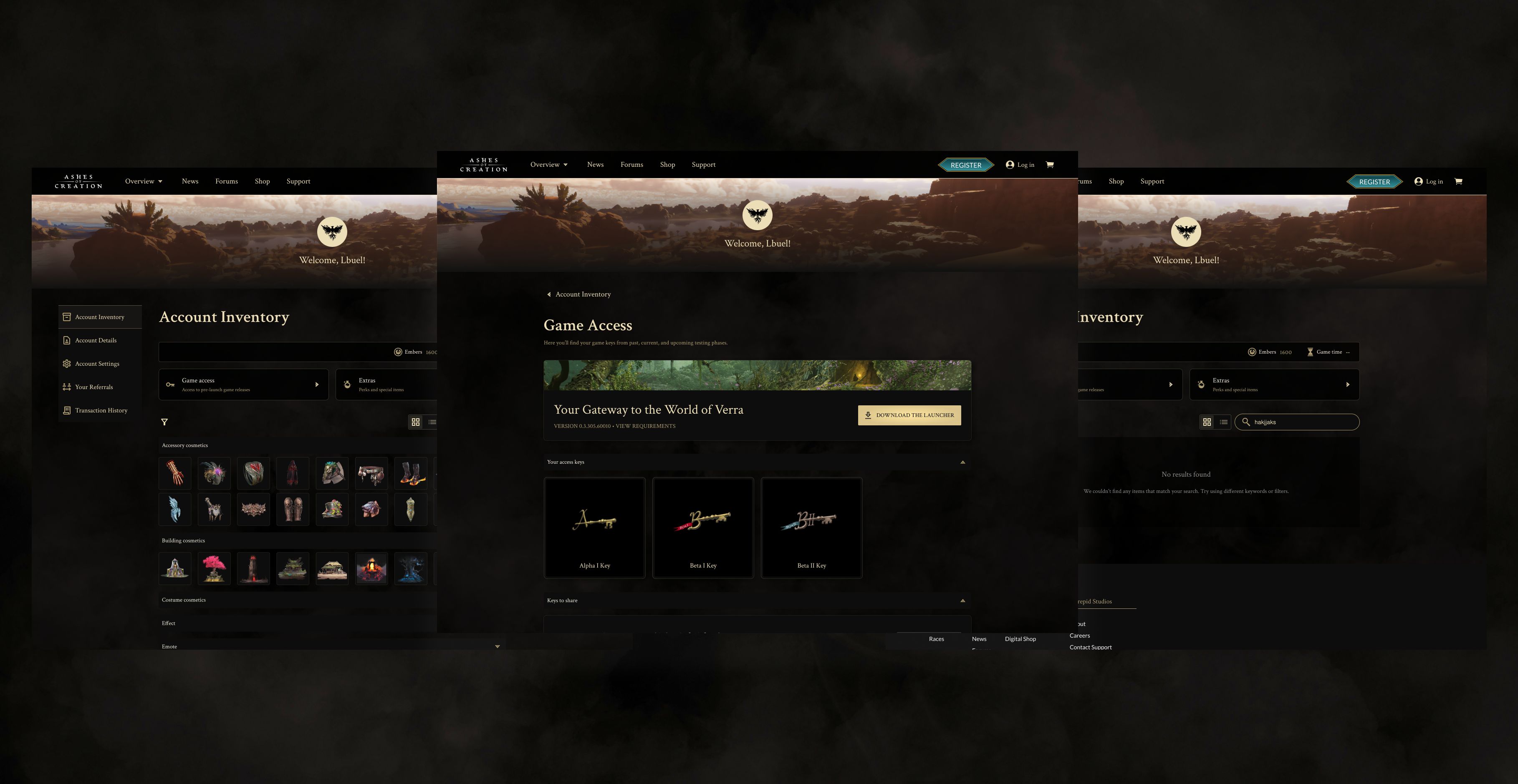
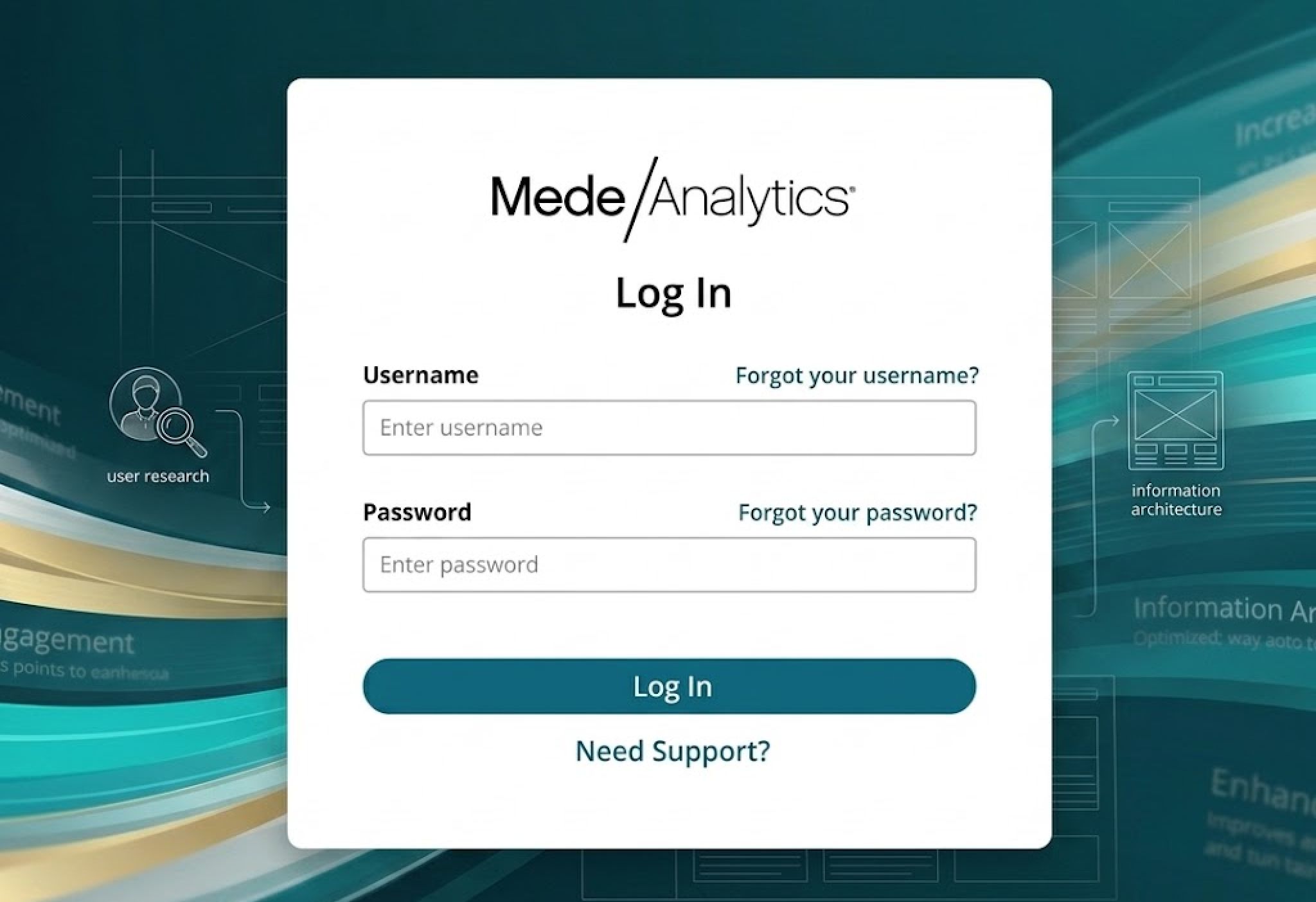
Intrepid Studios had never had a design system. As the team prepared to overhaul an internal admin tool that had grown inconsistent and hard to maintain, I built the studio's first from scratch in Figma, creating a shared foundation for both design and engineering. The system covered a responsive component library, a tokenized color system with light and dark mode support, and core foundations for typography, spacing, and interaction patterns. I worked closely with front-end developers throughout, aligning on naming conventions and implementation to make sure what lived in Figma translated cleanly into code. The result was a 50% reduction in development cycles and a single source of truth that has since influenced how other teams across the studio work.
The process & execution 🤺
01 Research & component strategy
I began by researching widely-used admin tools to identify common UI patterns and essential components—like tables, filters, forms, and modals. This helped define what we’d need to support a complex internal system. I then compared these findings with the V1 of our existing admin tool to identify gaps and opportunities for improvement. From there, I built a responsive, reusable component library in Figma using variants and auto-layout, creating a scalable foundation for consistent design and faster implementation.

02 Color token library & theming
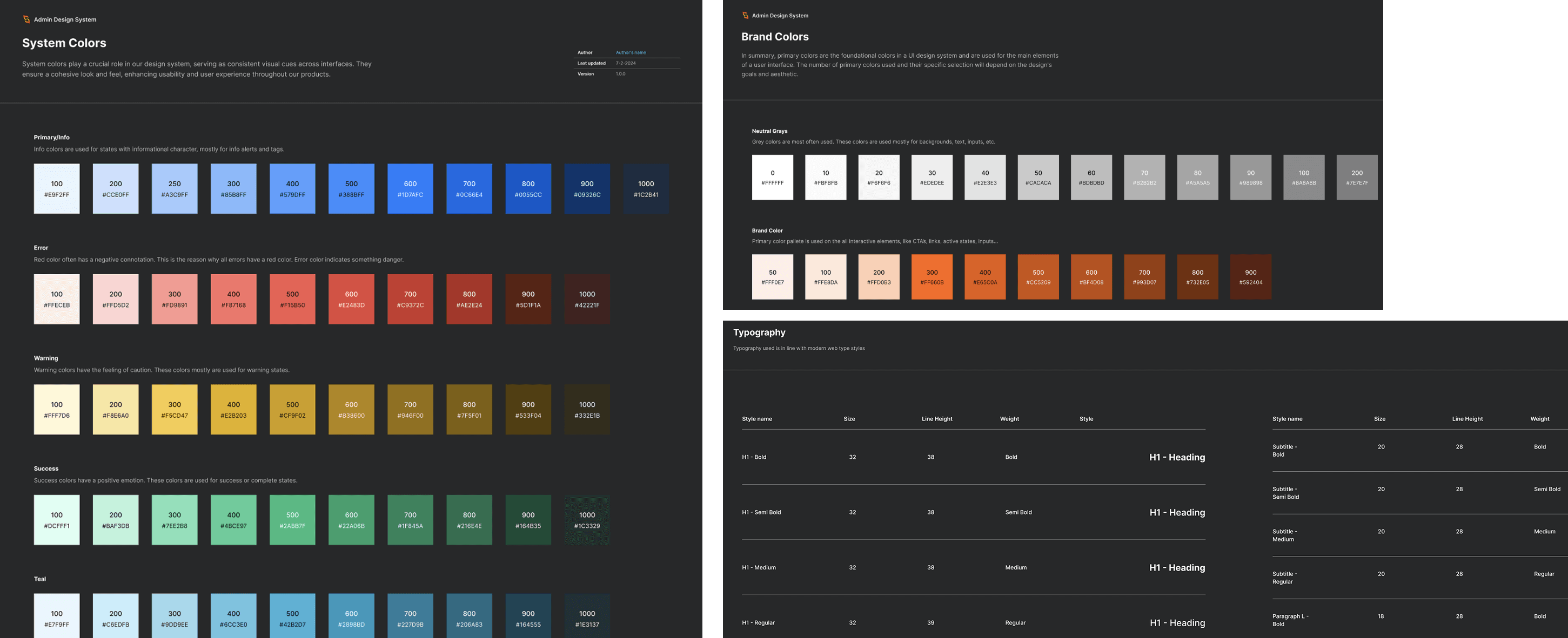
I designed a tokenized color system that could support both light and dark modes effortlessly. This structure allowed our team to make global updates with minimal effort while ensuring WCAG-compliant contrast ratios.

03 Establishing foundations (color, type, space)
To create a consistent visual language, I defined: - Color system: Primary, secondary, and neutral palettes, mapped to accessibility standards. - Typography hierarchy: Defined text styles for headings, body copy, and captions. - Spacing system: Scalable spacing values to maintain rhythm and structure across the UI.
04 Build component library
Using those foundations, I built a comprehensive set of reusable, responsive UI components in Figma using variants and auto-layout.
05 Design to code implementation
I collaborated with front-end engineers to translate the Figma system into coded components using a shared naming convention. This ensured a smooth transition between design and development, reducing the chances of inconsistencies.
06 Impact & results
50% Faster Development Cycles: Engineers could now pull ready-made components instead of rebuilding them from scratch
Increased Consistency: A single source of truth reduced design drift and inconsistencies across the product
Scalability: The design system became a foundation for future product iterations, enabling rapid prototyping and UI scalability
Key Takeaways
This project reinforced the importance of cross-functional collaboration and design systems thinking. By establishing a strong foundation, we not only improved the user experience but also enhanced efficiency across teams. The success of this design system has since influenced other teams in our organization, proving its long-term value.
Next Steps
With the core system in place, my next focus is on expanding the library with advanced interaction patterns, further optimizing accessibility, and continuously refining the system based on team feedback.