Inventory Redesign
Services
UX & Product Design
User Research & Usability Testing
UI & Visual Design
role
UX/UI Designer
Platform
Web ~ Desktop & Mobile
Timeline
3 weeks • 2025
Project Info
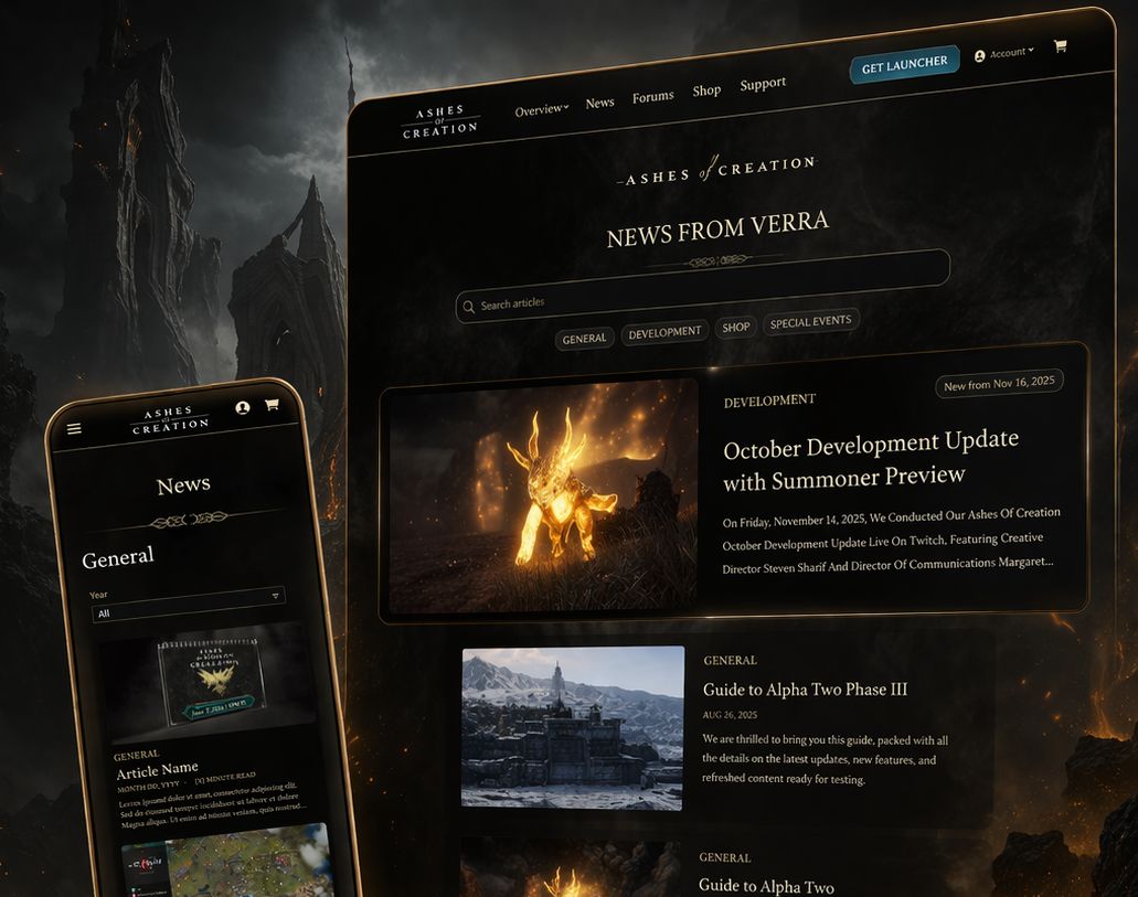
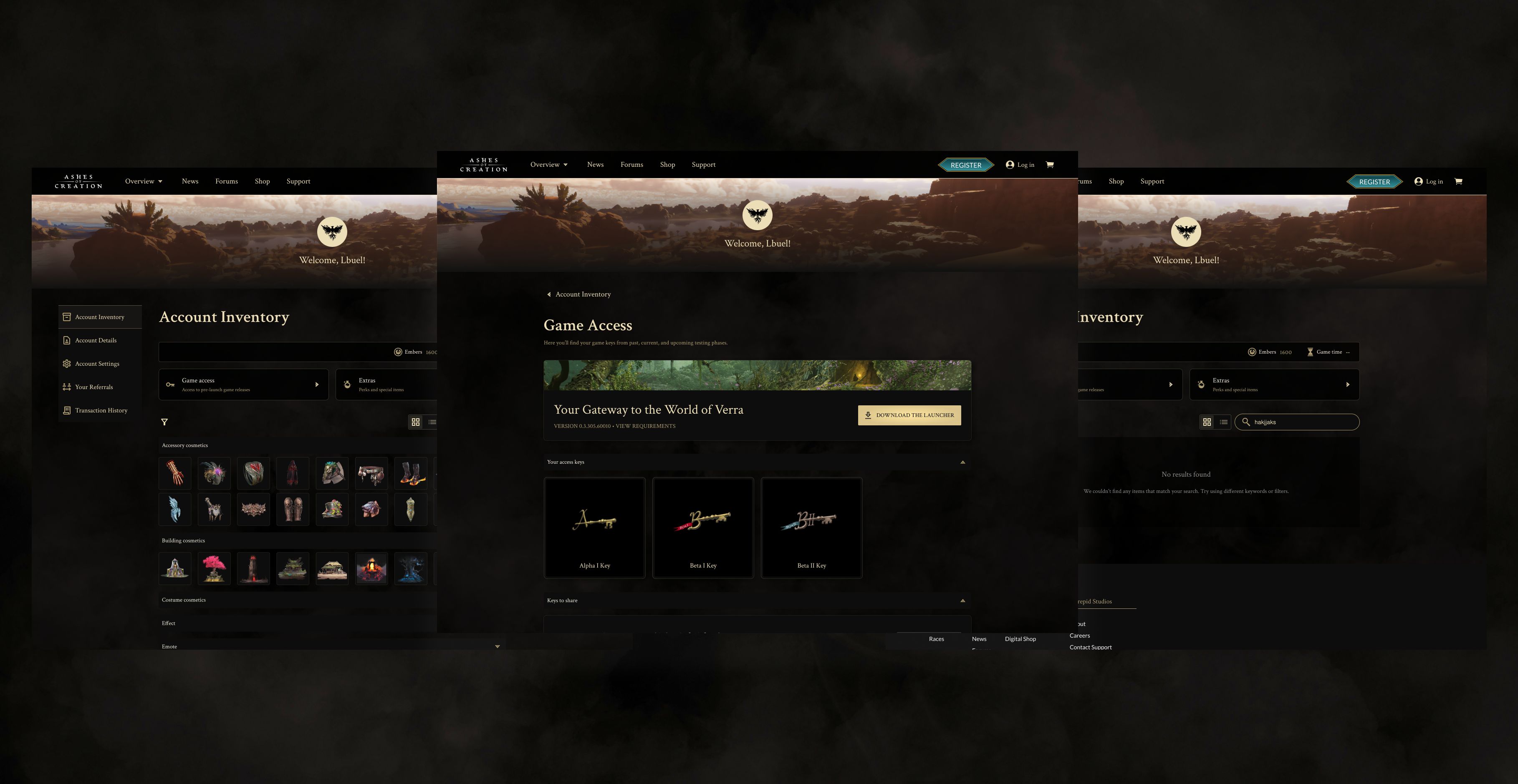
The Ashes of Creation account inventory had a scale problem. As the number of cosmetics, keys, and entitlements grew, a flat list with no real hierarchy made it increasingly hard for players to find what they owned, understand what they had access to, and feel good about the items they had collected. Support tickets followed. I led a full redesign of the inventory experience, rethinking the data model, categorization structure, filtering system, and item presentation. Research into game inventories, digital asset libraries, and e-commerce browsing patterns shaped a tiered organization model that mirrors how players naturally think about their collections. Items now surface with clearer visual hierarchy, reliable search, and a modular detail panel that handles complex states like claimable, expired, and locked without custom one-off solutions. The result is an inventory that feels less like a database and more like a collection, and a foundation engineering can build on without starting from scratch each time a new item type is introduced.
The process & execution 🤺
01 Research & component strategy
To understand player expectations, I studied how people manage large collections in different contexts. This included game inventories, digital asset libraries, e-commerce browsing, console UI layouts, and even TTRPG item sheets. Findings that guided the redesign: - Users rely on multi-layered categorization to make sense of large collections. - Visual markers such as symbols, color bands, and rarity tiers speed up recognition. - People scan in predictable Z patterns, so item anchoring and grouping matter significantly. - The best inventory systems allow both high-level browsing and deep item exploration without switching contexts.

02 A multi-layered categorization model
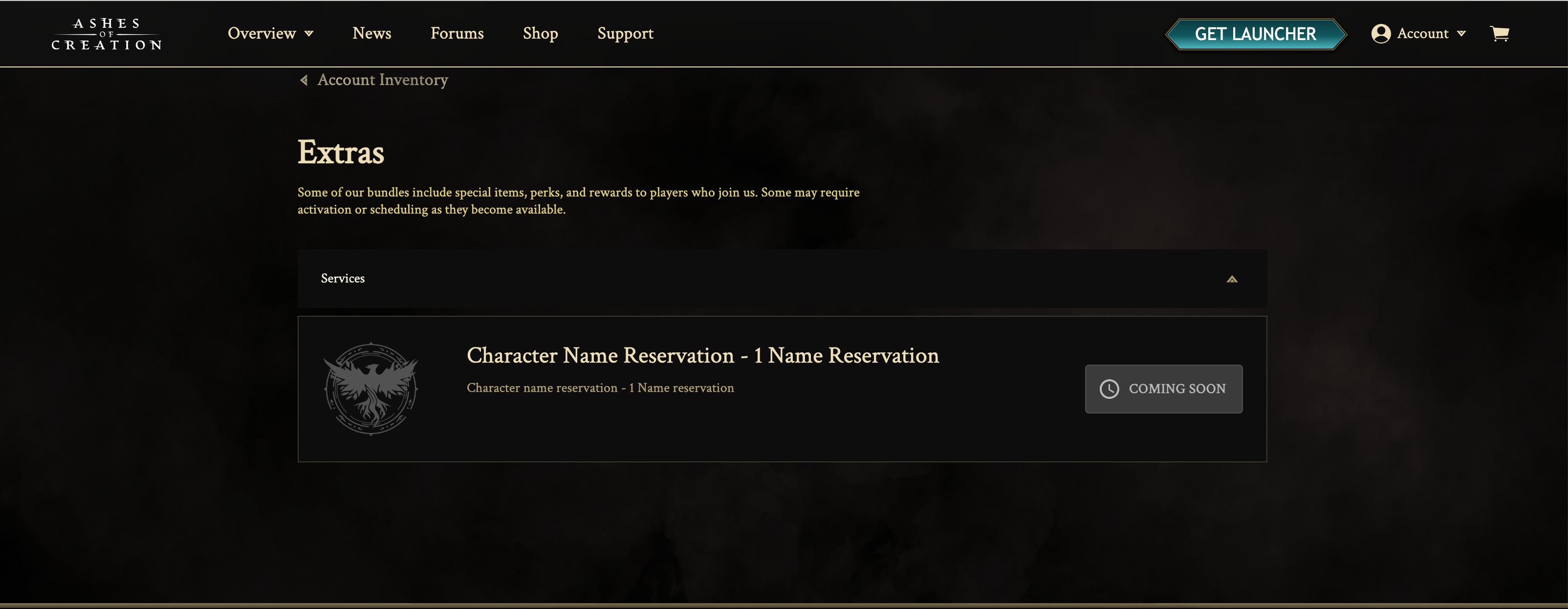
I redefined the information architecture by introducing a tiered category system that better reflects how players naturally think about their items. Inventory content is now grouped into three logical types: in-game cosmetics, keys (which unlock game access), and additional extras. This structure aligns with gameplay context, reduces cognitive load, and ensures a scalable framework that remains intuitive as new item types are introduced.
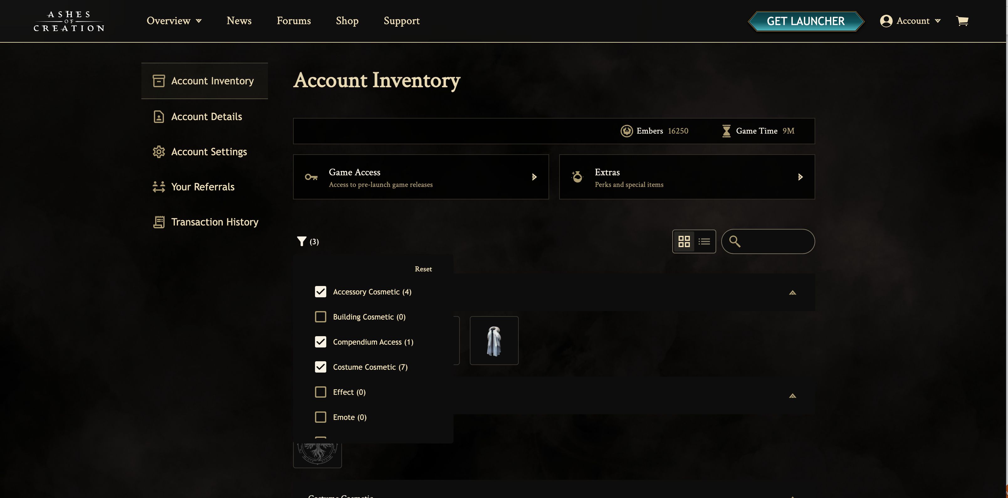

03 Robust filtering, sorting, and search
I designed a new interaction model for finding items quickly. The filtering panel supports combinations such as category type and name, but is designed in a way that supports the addition of future categorizations. Search now accounts for partial matches and player-friendly terminology, which solves one of the biggest frustrations in the legacy experience.
04 Item presentation designed for fast recognition
Each item received a redesigned card or title with clearer hierarchy and more distinctive visual signatures. Item names are more readable, descriptions are viewable, item images have been updated, and are now immediately visible. This creates a browsing experience that feels collectible and consistent with the fantasy theme of the world.
05 Scalable detail views and state logic
I introduced a modular detail panel that surfaces item attributes, eligibility, variants, and related items. It supports a predictable state system, including owned, claimable, expired, and locked. This gives players a breakdown of each item without forcing a page reload. Engineering can now support new item types through a repeatable pattern rather than custom building one off components.
06 Engagement enhancements
The new layout improves usability, but it also creates a sense of value. Items feel like rewards rather than database entries. The system supports browsing by theme, collection, or rarity, which taps into the emotional side of collecting. Players can finally explore what they own with clarity and excitement rather than confusion and frustration.
07 Impact & results
Significant reduction in confusion around item categories and ownership
Faster item identification due to clearer hierarchy and visual markers
Improved search reliability across all item types
A scalable inventory foundation that future-proofs content expansion
Fewer support questions related to missing or hard to find items
Key Takeaways
The redesigned Inventory experience transformed a confusing, hard to navigate system into a structured, scalable, and intuitive interface. CS teams can now quickly locate items, understand their status, and take action with confidence. The new foundations also set the stage for future game data integration without requiring another full overhaul.
Next Steps
Monitor Google Analytics to understand how often users interact with filters, categories, and item details
Identify high friction areas by comparing time on page and exit patterns before and after the redesign
Collaborate with CS to gather recurring feedback as new game data types are added
Expand component patterns to additional account areas where similar item based logic applies
Continue refining item grouping rules as more item states and categories emerge