Login Page Redesign
Services
UI & Visual Design
UX & Product Design
User Research & Usability Testing
role
UX/UI Designer
Platform
Web ~ Desktop
Timeline
2 weeks • 2022
Project Info
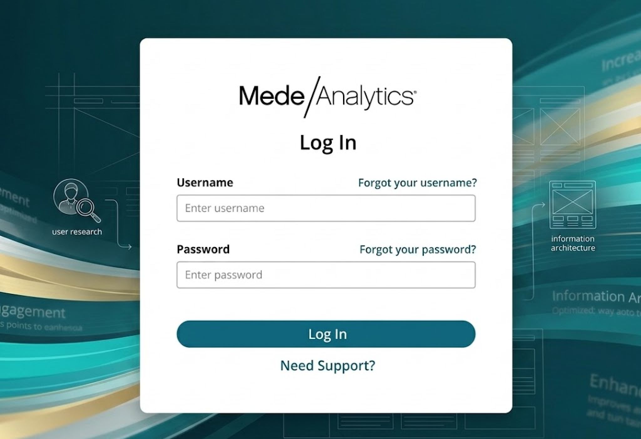
When MedeAnalytics updated its company-wide website, the login experience needed to follow. The existing screen no longer matched the new visual direction and had gaps in ADA compliance that needed to be resolved before anything shipped. The work was as much about collaboration as it was about design. Marketing had existing ideas for the new direction, so I started by meeting with their team, annotating their proposals for compliance issues, and sharing research into how other companies handle login UX. From there we aligned on a shared direction that respected their vision while meeting accessibility and usability standards. The final design centered the login container, introduced a gradient background, cleaned up the logo placement, and brought the visual language in line with the updated site. The project was completed in two weeks and delivered with full specs and redlines for engineering handoff.
Working cross-functionally
Working with the marketing team
As the redesign for this project crossed into marketing's territory, I began the design phase by meeting with their team to hear their thoughts. I took their ideas and made minimal updates to ensure they were ADA-compliant and up to industry standards, but I also included some more creative examples of ways we could design this.

Examples from marketing team
Below are the internal and external login page examples shared by the marketing team. In the first example, I included annotations on necessary changes to make these ADA-compliant. The second example shows minimal rearrangements to the layout based on UX best practices.

Research into better layouts
In the process of this redesign, I wanted to ensure that I wasn't being insensitive to the marketing team's ideas; however, I knew that I wanted to shift from their initial layouts. In providing notes on the designs they shared, I also took the opportunity to share how other companies handle this and some updated design options based on my findings.

Starting the design process - sharing designs with marketing
Based on some of the findings above, I sent a few layout examples to the marketing team along with the minimal changes necessary to their designs.

Main takeaways from idea sharing
Based on the designs shared throughout the teams, the main takeaways that both design and marketing agreed to move forward with included:
Aligning the login information in the center of the screen
Using a container to house the login information
Removing the Mede logo from the corner and placing it inside the container
Using a background with a gradient
Making the action button rounded

Final thoughts
My main takeaway from this project was learning to take advantage of and work with the ideas of other departments. It was the first time I had the opportunity to work with our marketing team on a ticket, which gave me a new outlook on designing for the company outside the Platform. I learned how important it is to value a different team's ideas and how to work together to create an end product that reflects the company's voice and follows UX best practices. The duties of departments can cross over more than we might think, so it's essential to a thriving work environment to develop relationships with people outside of your direct team and respect the input they have to share.